
June 2, 2025, 3:24 pm | Read time: 4 minutes
Colors play a significant role in our lives—even in interior design. Especially in the kitchen, the heart of every home, choosing the right color scheme is crucial. myHOMEBOOK author Carolin Chytrek shares what matters in color design.
“The eye eats with you”–everyone has probably heard this saying before. It’s not just a random phrase; it’s actually explainable through psychology. As numerous studies have shown in the past, our visual perception is directly linked to our taste perception and can even actively influence it. Enjoyment is not only about the stomach but is also captured through sight. Therefore, the design of the kitchen, especially regarding colors, should never be left to chance.
Follow myHOMEBOOK on WhatsApp now
Color Psychology
The choice of colors not only affects the aesthetics of a room but also shapes the mood that arises within it. The kitchen is considered the central meeting point of any home and therefore deserves special attention. Here, people cook together, create, exchange ideas, and laugh. That’s why the right design is particularly essential.
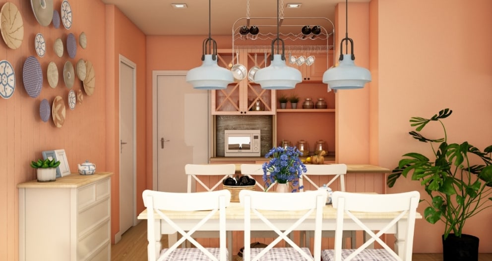
Vibrant shades of red, orange, or terracotta stimulate the appetite, bring energy into the room, exude a Mediterranean flair, and promote communication. These colors are especially suitable for large and social kitchens where life is bustling. For those who prefer tranquility, mindfulness, and refreshment, soft blues, greens, or pastels are the way to go.
Admittedly, many modern kitchens rely on neutral colors. They come in soft whites or are designed in warm greige or beige, often with wood or marble accents. Neutral tones like these are timeless and stylish all-rounders that highlight ingredients and creative dishes and never go out of style. Light colors also stand for purity and hygiene, which perfectly suits the kitchen’s functional environment and gives it an elegant and straightforward finish. Dark statement colors, on the other hand, add depth to the room and create a sense of coziness.

6 Children’s Room Trends for 2025

How to Bring Boho Style into Your Living Room

How to Achieve the Scandi Look on Your Balcony
Finding the Right Color for the Kitchen
Step 1: Determine Your Color Type
Before picking up a brush or planning new kitchen fronts, you should look inward and ask yourself: With which colors do you feel most comfortable? Are you the sensual type who thrives in warm tones, or do you long for order, clarity, and freshness? Then a cool color spectrum might be more suitable. Those who prefer to keep the kitchen timeless and neutral and work more with decorative elements should consider a design in sand or beige shades.
It’s fundamentally important to consider the style you want to pursue. The cozy country house look calls for light pastels, while statement kitchens in the industrial style demand grays and blacks, and those in the ethnic look are suited to bold, dark color mixes and patterns. For the Scandi or Boho style, a combination with light wood elements is suitable, and maritime kitchens enjoy a blue color palette.
Also interesting: 5 Tips for Designing a Modern Kitchen
Step 2: Create a Color Palette
To avoid overwhelming the room with color and to give the design more structure, it’s important to create a color palette based on your personal style. The general rule is: never use more than three to five base colors. The most beautiful kitchens appear seamless, thanks to a harmonious palette and the division into base, secondary, and accent colors, which are applied in a ratio of 60 percent, 30 percent, and 10 percent, respectively.
It’s not about keeping everything tone-on-tone, but about the deliberate interplay of colors. For example, walls or fronts can be designed in the base colors, furniture and rugs in the secondary colors, and light color accents can be added through decor and dishes.
Step 3: Wall or Furniture–What Should Shine?
If you want to design your kitchen appealingly, you should pay attention to the right balance between wall and furniture color. If the kitchen is to be equipped with dark or intense-colored fronts, the wall color can take a step back. Light walls in linen white, soft greige, or light blush tones are suitable here.
Even in minimalist kitchens, light walls have a calming effect and make matte black or wooden fronts stand out. If you opt for light fronts and still want to venture into color, you can paint the wall in moderate tones without overpowering the look. This is the key to successful kitchens: walls and furniture should play together like a duo and create harmony.