

July 3, 2025, 4:16 am | Read time: 5 minutes
Which Colors Will Dominate Summer 2025 and How to Stylishly Incorporate Them Into Your Home myHomebook reveals the colors that will dominate in summer 2025 and how you can stylishly integrate them into your home. Whether you’re redecorating or just planning a small summer update, here you’ll find the latest trends.
Summer brings fresh colors, inspiring natural tones, and bold accents into our homes. After years of minimalist grays and monochrome concepts, more color, warmth, and personality are returning to interior design. For those eager for change, there’s no need to redesign the entire house. By carefully selecting wall colors, textiles, or accessories, you can set powerful accents with the color trends of summer 2025 that transform a home.
Follow myHOMEBOOK on WhatsApp now
Sandstone, Greige & Warm Earth Tones Create a Calm, Natural, and Grounding Effect

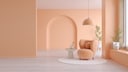
One of the key color trends of the year is the return to warm, natural earth tones. Particularly popular are sandstone, soft beige, and the elegant mix of gray and beige known as greige. These colors create a sense of calm and stability. They never feel cold but instead give the room depth and a sense of coziness. Using these colors in decor–such as painted walls, upholstered furniture, or curtains–can be beautifully complemented with light woods like oak or ash. Home accessories made of linen, jute, or untreated clay also blend harmoniously into this look. Subtle gold or bronze accents can add an elegant warmth to the room that feels sophisticated rather than overwhelming.
Aqua Mint, Soft Blue & Cornflower

Another trend is the move towards cool, fresh colors reminiscent of water and wind. Aqua Mint, Soft Blue, and Cornflower represent calm, expansiveness, and refreshment. Especially in summer, they feel like a gentle breeze flowing through the rooms. These colors are perfect for bathrooms or kitchens, as they are associated with cleanliness and freshness. They pair exceptionally well with white or natural stone, as these materials highlight the clarity of the colors.
For a modern look, Aqua Mint can be used in wall tiles or kitchen fronts, while Soft Blue on pillow covers or light summer blankets creates a serene atmosphere.
Butter to Sunflower Yellow – Delicate, Friendly, and Optimistic

Butter yellow is the surprise of the year and is among the top color trends of summer 2025. This light yellow hue or a more intense variant brings vibrant energy and instant good mood. And what would summer be without sunny accents? These shades are activating and friendly–perfect for spaces where people live, cook, or work. In the kitchen, a soft lemon yellow on curtains, sunflower yellow furniture like chairs, or accessories with lemon prints feels fresh and appetizing. Yellow can also unfold its positive effect as a wall color in the living room.
For those who want to start small, subtle decor elements in butter yellow are a good choice. Suitable items include pillows, ceramics, candles, or table lamps. To avoid it being too dominant, it’s recommended to combine it with neutral companions like white, light gray concrete, or soft natural wood. Even a bold sunflower yellow can look elegant when complemented with understated decoration.
Also interesting: Decor and home accessories in trendy butter yellow
Peach Fuzz, Salmon Pink & Coral

Also popular this year are the trend colors in the realm of warm pastels. Salmon pink, muted coral shades, and the Pantone trend color 2024 “Peach Fuzz” bring romance and warmth into play without appearing kitschy. These colors are easy on the eyes and create a soft, friendly atmosphere–especially in bedrooms, living areas, or lovingly designed entryways. As a wall color, Peach Fuzz appears particularly gentle and diffuse, lending the room a subtle elegance.
For those who prefer a bolder approach, salmon-colored velvet pillows, coral candles, or rose gold decorative elements can be used to play with the lighting mood. Even in combination with darker tones like anthracite or walnut wood, these colors unfold their special charm, providing both tension and harmony.
How to Decorate Your Home With the Trend Color ‘Peach Fuzz’

These Colors Will Be Trending in Home Decor in Fall 2025
Sage and Pistachio Green – Nature-Inspired and Calming

Of course, green hues, which have been a staple of contemporary design concepts for years, cannot be missed. In summer 2025, the color trends are dominated by two main variants: the delicate pistachio green and the slightly more subdued but highly elegant sage green. Both colors represent calm, nature, and balance. They look particularly beautiful in living or bedrooms, where they create a soothing atmosphere through painted walls, upholstered chairs, or selected decorative objects.
They pair excellently with materials like rattan, linen, or stone and fit both the minimalist Japandi style and a modern country house style. Plant lovers will especially appreciate sage green, as this tone complements green plants almost perfectly without competing.
Multicolor in Pastel
For those who like it lively but not too loud, delicate multicolor combinations are the way to go. A subtle, playful side trend combines several colors in a subtle way: Pastel shades like mint, butter yellow, sky blue, and soft pink are combined in fine gradations. This creates a cheerful but not chaotic picture–rather, it evokes a sense of lightness and playfulness, perfect for children’s rooms, creative workspaces, or bright kitchen areas. The key to success here is balance: The colors should make an impact without overwhelming. It’s important to use high-quality materials and clear lines to maintain order, so the colorful variety doesn’t become random.