

August 16, 2024, 3:12 am | Read time: 3 minutes
Some colors are best not combined. Otherwise, the atmosphere can quickly become uncomfortable. MyHOMEBOOK author and interior designer Odett Schumann explains which pairings don’t work well together.
When it comes to planning colors for interior design, people often choose their favorite colors—whether they match or not. This can sometimes look great, but it can also end in a visual disaster. Not all colors create a harmonious pairing in a living space. myHOMEBOOK author and interior designer Odett Schumann reveals which colors should not be combined.
1. Coral and Terracotta
Colors that are very similar in tone should not be combined. A clear example of this is the two shades of red, coral and terracotta. While one color appears pale and the other grayish, both share a mix of red and orange. Together, they look like a flawed image.
2. Black and White
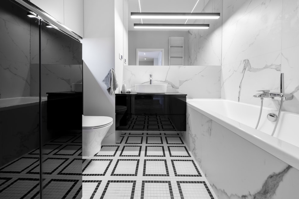
This combination is only unsuitable when a room is decorated solely in black and white. The duo is usually considered classic, but this is only true when beige or gray is added. These tones bring more warmth, depth, and elegance to the room. Without these additional colors, the black-and-white duo quickly becomes too extreme and not very homey. After all, it is the strongest color contrast.
3. Yellow and Violet
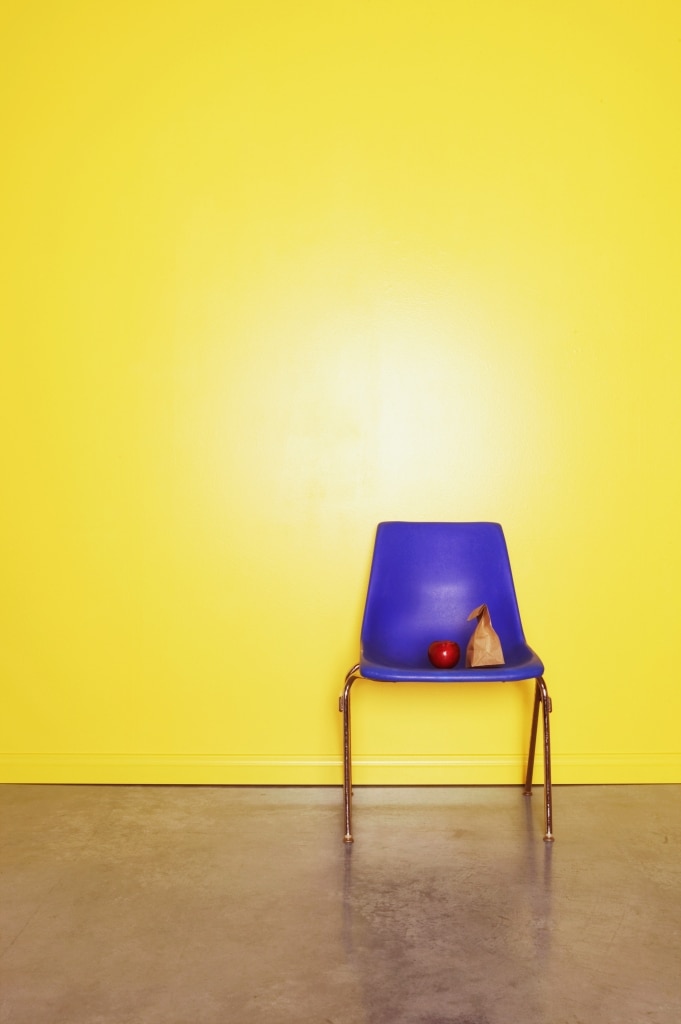
Violet, as a secondary color from red and blue, is already considered a challenging color to combine. It doesn’t really match any other tone. Especially the combination with its complementary color, yellow, is not particularly successful in interior design. It creates a particularly strong contrast that contributes to discomfort in the living space. It’s better to combine yellow with blue and violet with gray.
Also interesting: Why you should decorate a room with three colors
4. Black and Brown
Black and brown are also not a truly harmonious duo and should not be combined. Not only do both tones appear rather gloomy, but they are also too similar in tonality, making it difficult to distinguish between them. Neither color can stand out from the other. In this case, it’s better to opt for furniture or accessories made of dark wood or leather, as in the industrial style. These materials bring out much more natural character, adding vibrancy.

Decorating with Beige – How to Achieve the Look

Interior Tips for a Gender-Neutral Nursery
5. Brown and Orange
Once again, brown, like violet, is considered similarly complicated in interior design. An example of this is its pairing with orange. The combination of these colors creates more of a dated charm than a fashionable ambiance. So, it’s better to steer clear unless you’re intentionally aiming for a certain retro look, in which case this combination is the best choice.
6. Red and Yellow
The pairing of red and yellow is already known from discount stores. Special offers and sales are often advertised in this color combination. This low-quality character also comes into play in interior design, making the home appear less tasteful. Both colors are too loud in their tonality, creating a kind of rivalry in the room, making it feel very restless. The only way to successfully combine the two colors is to limit them to accessories, so red and yellow don’t clash.