

March 15, 2024, 9:09 am | Read time: 5 minutes
When something goes viral online these days, it’s usually a reliable sign that it will sell well in real life too. This could also be the case for Ikea’s new “Tesammans” collection. myHOMEBOOK author and interior designer Odett Schumann took a closer look at it. However, opinions in the editorial office are divided.
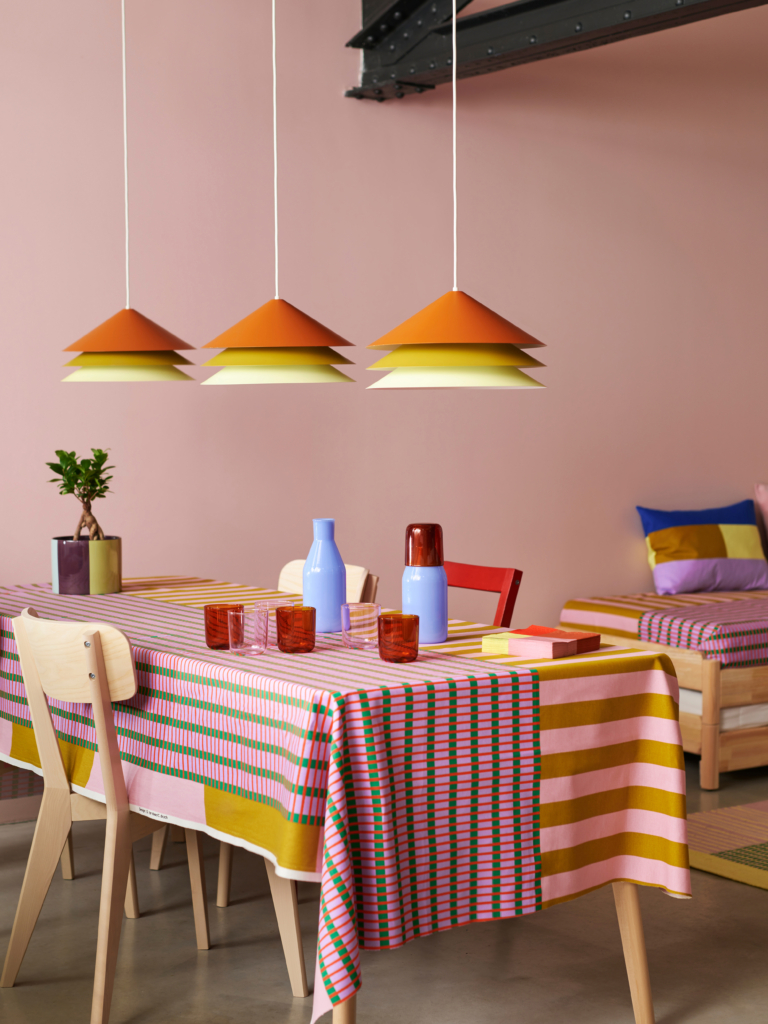
The new “Tesammans” collection from Ikea has been discussed online for weeks. However, the Swedish furniture company will not release it until March 30. What makes the collection so special already? Just in time for spring, “Tesammans” arrives in a burst of colors. The Dutch design duo “Raw Color” is responsible for this. The collaboration combines Ikea’s furnishing expertise with the duo’s design language. Their focus on minimal shapes, graphic lines, and bold colors is clearly evident. “Tesammans” is a limited collection that typically includes several pieces of furniture, textiles, and decorative items from Ikea.
Color in Focus
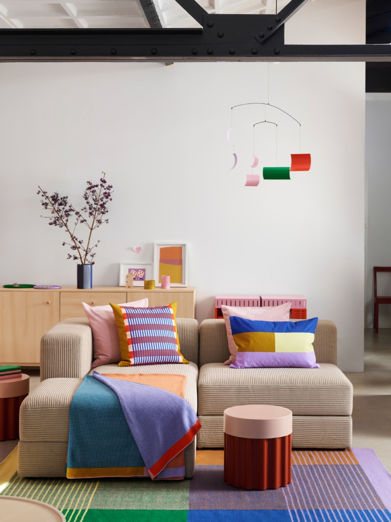
The return of colors has been celebrated in interior design for some time. The popular Swedish furniture store is also joining the trend, but Ikea’s response is not just in solid colors. Instead, it’s strong, harmonious combinations of several shades that give the collection a particularly sophisticated twist.
“A color is never alone; color needs company,” explain Daniera ter Haar and Christoph Brach from the Dutch design studio. The duo chose a total of 15 different colors. When working on “Tesammans,” it was important to them to balance saturated colors with soft, muted tones. Pairings were always combined so that the colors could enhance each other. “We find it exciting how different shades interact,” says the design team.
Also interesting: These are the color trends for spring 2024
Contrasting Combinations
The idea was to transform everyday items like a wall clock, cushions, or lampshades into something special. To achieve this, the designers combined bold with soft colors. The best example is the two-tone, round “Tesammans” side table, made of corrugated steel and a simple tabletop.
“We always look for colors that enhance each other,” says the design team. “For example, red next to pink looks tone-on-tone, but next to blue, it appears brighter and more contrasting. It’s like a recipe–you have to find the right balance to make an object shine!” The contrasting pairings of trays and tealight holders are also equally harmonious.

Is the Ikea Collection by Gustaf Westman Worth the Hype?

Which Colors Shouldn’t Be Combined
A Collection and Its Practical Details
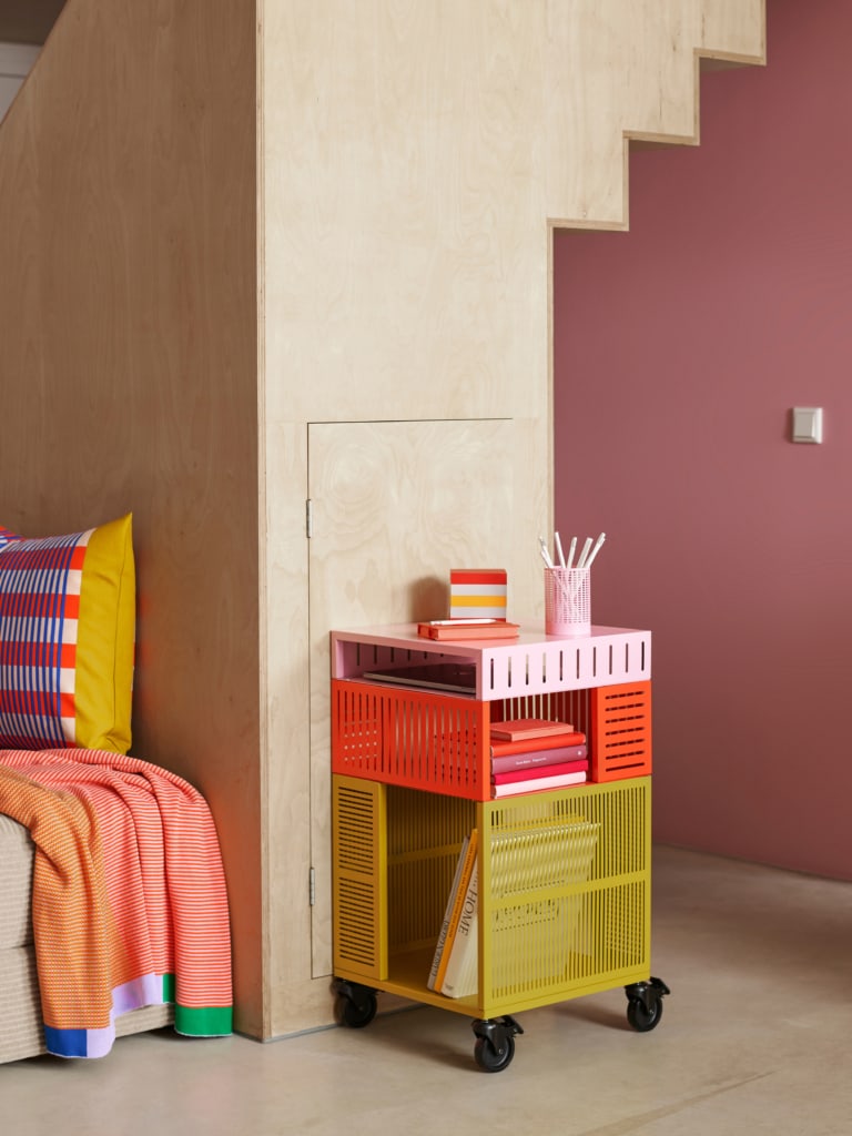
In addition to the clearly recognizable color highlights, the design of “Tesammans” is also characterized by its many clever details. For example, the mobile storage element of the series proves to be an extremely practical everyday helper, especially in the bathroom, kitchen, or home office. Simply push it where it’s needed. The piece of furniture is also accessible from all four sides.
The previously mentioned red-pink side table not only serves as a mere surface but also reveals plenty of storage space inside. The collection also includes colorful glasses and a matching carafe, which can even be stacked to become one product.
“Tesammans” Aims to Bring Color and Joy to Everyday Life
Considering that white is increasingly becoming the standard in interiors, Ikea and Raw Color aimed with “Tesammans” to encourage people to let more color and joy back into their homes. After all, colors can have a significant impact on their immediate surroundings and ideally contribute to a positive sense of well-being in everyday life.

A Successful Collection with Harmonious Colors
“That ‘Tesammans’ is already going viral on social media weeks before its actual launch doesn’t surprise me. It’s a visually appealing collection with harmonious color pairings that hits the market just in time for the start of spring. What a clever move by Ikea! Moreover, all the colors, especially for the German taste accustomed to natural tones, are neither too garishly colorful nor too dull. They are simple, practical everyday items that fit well into almost any home. In short: I’m also eyeing one or two pieces from the collection…”
More Color, but Not a Nursery!
“Even though I keep my own apartment in a more classic style, I love seeing colorful living styles on Instagram, TikTok, Pinterest, or, of course, in person. I particularly like the interior trend ‘Danish Pastel.’ Many colors are just fun! However, in my opinion, it’s essential that, especially with wild color combinations, the various elements make a high-quality impression; otherwise, it quickly looks like a nursery. However, the new Ikea collection evokes exactly this association for me. I like the rolling side table and the cushion covers the least, as the color combinations do not appeal to me at all. I support ‘more courage for color,’ but in my opinion, the implementation in the ‘Tesammans’ collection has not succeeded.”